
Introducing 8 New Cabinet Colors
We’ve expanded our cabinet color collection — and this launch is all about making your design decisions easier, not harder.
Each of these eight new finishes was chosen specifically to pair beautifully with the rest of our collection. All eight are now a part of our standard offering – so mixing and matching cabinet and countertop tones has never been simpler. Whether you’re leaning moody and dramatic or soft and neutral, there’s a new color here to help bring your vision together.
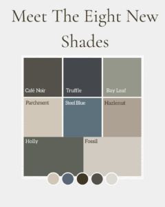
Meet the New Colors
Steel Blue — A cool, sophisticated slate blue that adds depth without overwhelming a space
Parchment — A warm, understated neutral that feels timeless in any kitchen or bath
Truffle — A rich, near-charcoal tone for those who want cabinetry with serious presence
Hazelnut — A soft, earthy taupe that brings warmth to both modern and traditional spaces
Holly — A deep, muted green with quiet organic character
Café Noir — A deep espresso brown that grounds a room with quiet richness
Fossil — A light, warm greige that pairs effortlessly with almost any palette
Bay Leaf – A versatile, medium-depth green-gray
Why It Matters
Great kitchens and baths are built on contrast and harmony — cabinets that complement countertops, hardware, and flooring rather than compete with them. These eight additions were developed with exactly that in mind, so no matter which combination you choose, it’s designed to work together seamlessly.
Pairing New Cabinets with Our Stone Countertops
To spark some ideas, here are a few cabinet-and-countertop combinations we love:
- Steel Blue + Calacatta Mont Blanc — Cool blue cabinetry grounded by soft gray veining.
- Parchment + LG Viatera Cotton White — A tone-on-tone pairing that feels clean and timeless.
- Truffle + Silestone Eternal Calacatta Gold — Deep charcoal balanced by warm gold veining.
- Hazelnut + French Alps — Warm taupe paired with a light, airy stone.
- Holly + Alleanza Bianco Venatino — Rich green set against classic white veined quartz.
- Café Noir + Calacatta Venice — Espresso-dark cabinets with bright, gold-veined stone.
- Fossil + Montclair — Two soft, warm neutrals layered for an understated look.
These are just a starting point — every new cabinet color was designed to work with our broader collection, so feel free to mix, swap, and experiment until you find what feels right for your space.
Tips for Choosing Your Palette
Not sure where to begin? Start with the mood you want your space to have. Lighter combinations like Fossil and Parchment tend to open up a room and feel airy, while deeper tones like Truffle or Café Noir create a cozier, more intimate atmosphere. Consider your existing flooring, hardware, and lighting too — warm metals lean naturally toward Hazelnut and Holly, while cool finishes like brushed nickel pair well with Steel Blue. And don’t be afraid to mix: two-tone kitchens, with a darker island and lighter perimeter cabinets, remain one of the most popular ways to bring several of these new colors into a single space.
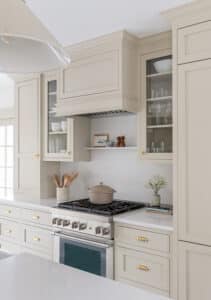
Ready to Bring these Colors Home?
Renovating a kitchen or bath may seem daunting, but Metropolitan’s experienced team is here to make it easy. Line up your trade professional, set your priorities and budget, and choose your appliances before design begins. From there, schedule a consultation with a Metropolitan designer to see these colors and stone pairings in person, review your room’s measurements and inspiration photos, and walk through our process from design to production.
Stop by one of our showrooms to get started: Norwood (Design Studio & Stone Slab Gallery, and Cabinet Shop, Stone Shop & Warehouse, 505 University Avenue, 781-949-8900), Watertown (450 Arsenal Street, 617-926-8900), Natick (10 Mercer Road, 508-651-8950), Wakefield (2 Pleasure Island Road, 781-246-0745), or Boston (1175 Dorchester Ave., 781-949-8970).
Now’s the perfect time to start exploring what these eight new colors, paired with the right stone, can bring to your next project.